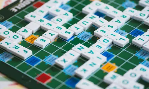
A grid of colored squares can be a delightful social signal. It says that you played, struggled, or solved without displaying the answer itself. Yet the same compact format can become confusing in a notification, exhausting when read aloud, or meaningless when color differences are hard to perceive. The challenge is not to abandon sharing. It is to preserve the celebration while making the information understandable to more of the people receiving it.
This guide develops original sharing examples and a practical review checklist. It is informed by W3C accessibility explanations, but it is not a formal conformance audit or a report of testing with disabled players. Needs vary, and a single replacement format will not satisfy everyone. The useful starting point is to ask what the result needs to communicate and which parts of that message currently depend on a visual convention alone.
Decide which information the result actually contains
A result usually combines several facts: the game, edition, outcome, attempts or time, assistance used, and sometimes a visual history of progress. Write those facts out before choosing a format. You may discover that most can fit in one short sentence. The decorative grid can remain optional rather than carrying the entire message. This also helps when an image fails to load or a preview crops the bottom of a share card.
For an invented result, write: Detective Word Case, November 6 edition, solved in four of six attempts, one process hint used. That sentence does not reveal a target word. It gives the reader a game identity, a date, a result, and the conditions of play. If the attempt history matters, add it separately with a spoiler warning or an expandable control. Do not assume everyone wants the same level of detail immediately.
Color should reinforce a label, not replace it
W3C's explanation of the use-of-color criterion states the central accessibility concern: color alone should not be the only way information is conveyed. For a puzzle result, that suggests supplementing a colored state with text, a symbol, a pattern, or another distinguishable cue. A green tile can also carry a fixed-position label, and an absent letter can have an explicit state instead of relying only on a muted background.
In an original interface example, imagine three tile states labeled exact, present elsewhere, and absent. Those labels describe the meaning without requiring a specific palette. The visible design can still use the website's detective-red accent and aged-paper panels. Accessibility does not demand an unrelated white page. It asks that the information survive when a particular visual distinction is unavailable or misunderstood.
Offer a short text summary before the detailed grid
A long sequence of emoji can produce a reading experience very different from the visual one. Instead of assuming how every assistive tool will announce it, test the actual format you plan to share and provide a concise text alternative. A short summary at the start gives context before the reader encounters decorative or repetitive detail. It also benefits someone reading quickly on a small screen.
Keep the summary specific enough to be useful. Solved it is friendly but omits the game and edition. Solved the November 6 Detective Word Case in four attempts is clearer. If a timer is relevant, identify its unit and whether it includes pauses. If assistance was used, describe it briefly. These details make a result interpretable without forcing the reader to decode the image or ask follow-up questions.
Protect the reveal in text as well as images
Spoiler avoidance is not only a matter of hiding the final answer. A category title, the exact first letter, or a list of rejected candidates can reveal the solution by elimination. Put the least revealing information first. Avoid an answer-bearing image as the first attachment in a conversation where previews are automatic. A spoiler label is useful only if the revealing material does not appear before the label can be read.
For a group chat, agree on a simple convention. Start with game and edition, state spoiler-free result, and place any discussion of clues in a separate message or channel. Ask before sending a direct hint to someone who has not finished. A social ritual works better when readers can choose when to cross from celebration into analysis. The same convention helps people in different time zones encounter the puzzle on their own schedule.
Make controls reachable without a pointer
W3C's keyboard guidance explains the importance of operating functionality through a keyboard interface. On a share panel, the practical questions are straightforward: can you reach Copy result, Download image, and Close in a sensible order? Can you see which control has focus? Can you leave the panel without getting trapped? These are concrete actions you can inspect rather than abstract promises that a page is accessible.
Try the panel using the keyboard before reaching for the mouse. Record the sequence of focused controls and note any point where focus disappears. A decorative icon that looks like a close button but cannot receive focus is not an adequate control. Use a real button with a clear accessible name. If the panel is modal, focus behavior should support returning to the place where the player opened it.
Check the image when it becomes small
A share card that looks elegant at full size can become unreadable in a chat thumbnail. Render it at a smaller width and inspect the game name, edition, and result. Avoid putting essential information into tiny decorative type. A large background photograph can support the theme, but it should not reduce the contrast of the text that carries the actual score. Place text on a stable panel rather than over a busy detail.
The detective style offers useful visual tools: a paper-colored content area, a strong dark heading, a restrained red accent, and a compact evidence label. Use those tools consistently. A large faint stamp can be decorative while the result remains clearly printed beside it. The aim is to preserve a coherent website identity without requiring the reader to distinguish every texture, shadow, or distressed edge to understand the message.
Distinguish speed from success
Not every player wants a timer to define the result. Some enjoy deliberate deduction, some use assistance, and some interact through controls that take more time. If a game supports untimed play, make that condition visible rather than treating it as a missing score. A result saying solved, untimed is complete. It should not need a fake zero-second time or a visually inferior badge to fit the card template.
When comparing results, choose what the group actually wants to compare. A speed challenge and a collaborative case discussion are different activities. State the conditions before play. If a person changes zoom, uses a keyboard, or takes a break, do not infer what that says about their ability. The shared result can report the conditions without turning them into a judgment. Good presentation separates the outcome from assumptions about the player.
Respect motion preferences in the celebration
A solved animation can be enjoyable while still being unnecessary to understand the result. Make the final state available without requiring someone to watch every movement. Avoid using a rapidly moving stamp or flashing highlight as the only indication of success. If the interface supports reduced motion, check that the message remains understandable when transitions are shortened or removed. A celebration should not block access to the information it celebrates.
In a practical design review, open the share panel, request reduced motion through the available platform setting, and repeat the same action. Compare the final text and control availability. You are checking a specific interaction, not declaring the entire product conformant. Document what you observed and what you did not test. That honest boundary makes the review useful to the next person who needs to investigate a different device or assistive setup.
Write alternative text for the message, not every decoration
If a result image communicates facts not present nearby, its alternative text should convey those facts. A description that lists paper texture, a magnifying-glass icon, and red borders but omits the solved status misses the image's purpose. Conversely, if an adjacent text summary already communicates the same result, avoid forcing the reader through a long duplicate explanation of every decorative square.
An original example is: Detective Word Case, November 6 edition, solved in four of six attempts with one process hint. If the visible image also includes a detailed guess pattern that matters to the discussion, provide that separately in an optional text section. The right level of detail depends on the context. Ask whether the description helps the reader participate in the conversation rather than merely proving that the image was described.
A small review you can actually repeat
Choose one share card and one share dialog. Inspect them at normal size and thumbnail size. Read the text summary without looking at the colored grid. Navigate the dialog with a keyboard. Check focus visibility, a meaningful close control, and the final state with reduced motion. Then inspect whether the first visible preview reveals an answer. Keep a short record of the device, browser, and exact interaction used for each observation.
This checklist is intentionally limited. It does not replace testing with real users, a complete accessibility evaluation, or the full requirements of any legal standard. It gives a puzzle team concrete questions to investigate before assuming that a visually appealing card works for everyone. If someone reports a barrier, their specific experience is evidence to examine, not a challenge to dismiss because a small internal checklist passed.
Keep the social invitation open
The best result format lets the next person join the conversation without extra decoding. It names the game and edition, states the outcome, discloses relevant assistance, and preserves the reveal. Color, photography, and noir styling can enrich that message. They should not be the only way the message exists. A strong visual identity and a useful text alternative can support the same purpose.
Our examples and checklist are original editorial constructions informed by the linked W3C explanations. We did not conduct an assistive-technology study or certify a product. The transferable principle is participation: share enough information for another person to understand the result, and give them control over spoilers and detail. A puzzle win is more enjoyable when the people invited to celebrate it can actually read what you shared.